> ## Documentation Index
> Fetch the complete documentation index at: https://developer.box.com/llms.txt
> Use this file to discover all available pages before exploring further.

# Box UI Elements

export const BuildPortals = () => {
  const cards = [{
    id: "blog",
    type: "BLOG POST",
    title: translate("Build a content portal using Box UI Elements"),
    cardTitle: translate("Read more about creating custom portals"),
    description: translate("Build a content portal with a customized experience using Box UI Elements."),
    image: "/static/box-ui-elements/image-BUIE-portal.png",
    href: "https://medium.com/box-developer-blog/build-a-content-portal-using-box-ui-elements-react-tailwind-css-vercel-part-1-f1c509621ceb"
  }, {
    id: "sample",
    type: "SAMPLE CODE",
    title: translate("Box Custom Portal Demo"),
    cardTitle: translate("Clone and deploy a demo project"),
    description: translate("Featuring Box APIs, Box UI Elements, React, Tailwind CSS, and Vercel."),
    image: "/static/box-ui-elements/image-BUIE-sample.png",
    href: "https://github.com/box-community/box-custom-portal-demo?tab=readme-ov-file#box-custom-portal-demo"
  }, {
    id: "video",
    type: "VIDEO DEMO",
    title: translate("Box AI in Content Preview UI Element"),
    cardTitle: translate("Box AI for Box UI Elements"),
    description: translate("See how to embed Box AI in the Content Preview UI Element."),
    image: "/static/box-ui-elements/image-BUIE-AI.png",
    hasVideoBadge: true,
    href: "https://www.youtube.com/watch?v=8DmMgkm-6Tw"
  }];
  return <section className="max-w-[1400px] mx-auto px-4">
      <div className="text-center mb-12">
        <h2 className="text-3xl font-bold text-gray-900 dark:text-white mb-4">
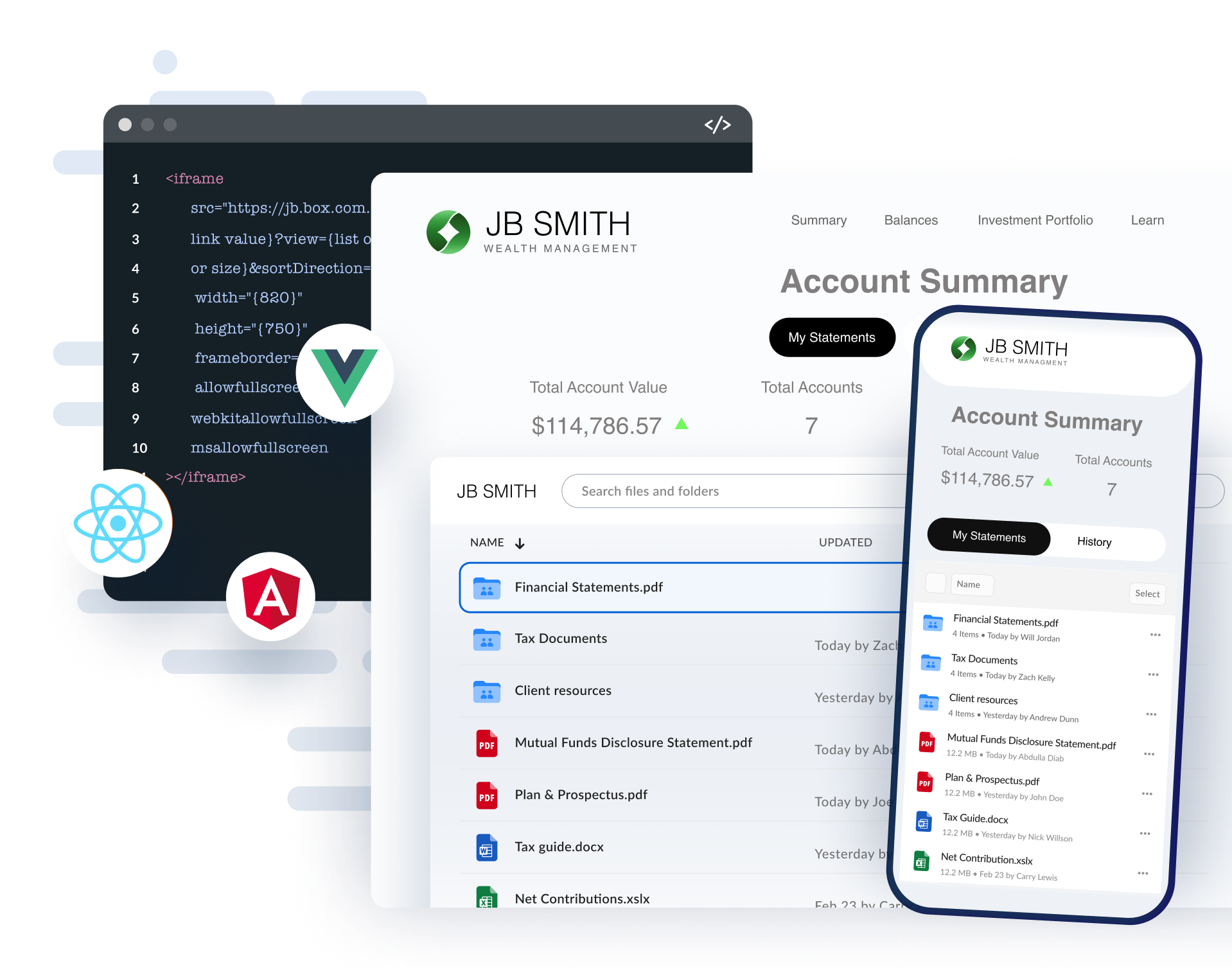
Build custom portals</h2>
        <p className="text-lg text-gray-600 dark:text-gray-400">
          Learn more from videos, blog posts and sample code related to Box UI Elements.
        </p>
      </div>

      <div className="grid grid-cols-1 md:grid-cols-2 lg:grid-cols-3 gap-6">
        {cards.map(card => <a key={card.id} href={card.href} className="group flex flex-col rounded-xl bg-white dark:bg-gray-900 border border-gray-200 dark:border-gray-700 transition-shadow hover:border-blue-500 dark:hover:border-blue-500">
            {}
            <div className="p-3">
              <div className="relative bg-blue-900 dark:bg-blue-950 rounded-xl overflow-hidden">
                <img src={card.image} alt={card.title} className="w-full" />
              </div>
            </div>

            {}
            <div className="px-3 pb-3 flex-1">
              <h3 className="font-bold text-gray-900 dark:text-white mb-2">{card.cardTitle}</h3>
              <p className="text-sm text-gray-600 dark:text-gray-400">{card.description}</p>
            </div>
          </a>)}
      </div>
    </section>;
};

export const ExploreMore = () => {
  const [hoveredCard, setHoveredCard] = useState(null);
  const cards = [{
    id: "ai",
    title: translate("Box AI for UI Elements"),
    description: translate("See how to embed Box AI in the Content Preview UI Element."),
    img: "/static/box-ui-elements/icon-ai.svg",
    href: "/guides/embed/ui-elements/preview/#box-ai-for-ui-elements"
  }, {
    id: "uploader",
    title: translate("Content Uploader"),
    description: translate("Embed the Content Uploader and allow users to upload files."),
    img: "/static/box-ui-elements/content.svg",
    href: "/guides/embed/ui-elements/uploader/"
  }, {
    id: "metadata",
    title: translate("Metadata view"),
    description: translate("Display files based on specified metadata with the Content Explorer."),
    img: "/static/box-ui-elements/metadata.svg",
    href: "/guides/embed/ui-elements/explorer/#metadata-view"
  }, {
    id: "annotations",
    title: translate("Annotations"),
    description: translate("Provide collaboration capabilities within the Content Preview."),
    img: "/static/box-ui-elements/annotations.svg",
    href: "/guides/embed/ui-elements/annotations/"
  }];
  return <section className="max-w-[1400px] mx-auto px-4">
      <h2 className="text-3xl font-bold text-gray-900 dark:text-white mb-3">Explore more Box UI Elements</h2>
      <p className="text-gray-600 dark:text-gray-400 mb-12">
        Follow more guides and documentation to help get you up and running.
      </p>

      <div className="grid grid-cols-1 md:grid-cols-2 lg:grid-cols-4 gap-6 mt-4">
        {cards.map(card => <a key={card.id} href={card.href} onMouseEnter={() => setHoveredCard(card.id)} onMouseLeave={() => setHoveredCard(null)} className={`p-6 rounded-lg transition-all duration-300 cursor-pointer bg-white dark:bg-gray-900 ${hoveredCard === card.id ? "border border-blue-500" : "border border-gray-200 dark:border-gray-700 hover:border-gray-300 dark:hover:border-gray-600"}`}>
            <div className="w-12 h-12 rounded-lg flex items-center justify-center mb-4">
              <img src={card.img} alt={`${card.title} icon`} className="w-12 h-12" />
            </div>
            <h3 className="text-lg font-semibold text-gray-900 dark:text-white mb-2">{card.title}</h3>
            <p className="text-sm text-gray-600 dark:text-gray-400">{card.description}</p>
          </a>)}
      </div>
    </section>;
};

export const InteractiveDemos = () => {
  const [activeDemo, setActiveDemo] = useState("explorer");
  const demos = {
    explorer: {
      title: translate("Content Explorer"),
      description: translate("Embed a folder view of content stored in Box in your web applications. Allow users to navigate through the folder hierarchy and rename, delete, or share files."),
      iframeUrl: "https://codepen.io/box-platform/embed/wdWWdN?default-tab=result"
    },
    picker: {
      title: translate("Content Picker"),
      description: translate("Add support for selecting Box files and folders in your web applications."),
      iframeUrl: "https://codepen.io/box-platform/embed/PWPxBm?default-tab=result"
    },
    preview: {
      title: translate("Content Preview"),
      description: translate("Embed high quality and interactive previews of over 120 file types."),
      iframeUrl: "https://codepen.io/box-platform/embed/rmZdjm?default-tab=result"
    },
    previewSidebar: {
      title: translate("Content Preview with Sidebar"),
      description: translate("Implement viewing file-related activity, metadata, and details including versions, comments, and tasks."),
      iframeUrl: "https://codepen.io/box-platform/embed/pqBMgM?default-tab=result"
    }
  };
  const demoKeys = Object.keys(demos);
  const currentDemo = demos[activeDemo];
  return <section className="max-w-[1400px] mx-auto px-4">
      <h2 className="text-3xl font-bold text-gray-900 dark:text-white mb-3">Interactive Demos</h2>
      <p className="text-gray-600 dark:text-gray-400 !mb-8">
        Box UI Elements are available both as React components and framework-agnostic JavaScript libraries.
      </p>

      <div className="grid grid-cols-1 lg:grid-cols-4 gap-6 h-screen lg:h-auto mt-4">
        {}
        <div className="flex flex-col gap-4 justify-between">
          {demoKeys.map(key => <button key={key} onClick={() => setActiveDemo(key)} className={`p-4 rounded-lg cursor-pointer transition-all text-left ${activeDemo === key ? "border border-blue-500 dark:bg-gray-900" : "border border-gray-200 dark:border-gray-700 bg-white dark:bg-gray-900 hover:border-blue-500 dark:hover:border-blue-500"}`}>
              <h3 className="font-semibold text-gray-900 dark:text-white mb-2">{demos[key].title}</h3>
              <p className="text-sm text-gray-600 dark:text-gray-400">{demos[key].description}</p>
            </button>)}
        </div>

        {}
        <div className="lg:col-span-3 h-full lg:h-[605px] rounded-lg overflow-hidden border border-gray-200 dark:border-gray-700">
          <iframe title={`${currentDemo.title} Demo`} src={currentDemo.iframeUrl} height="605" className="w-full h-full border-0" allowFullScreen={true} loading="lazy" />
        </div>
      </div>
    </section>;
};

<div className="flex flex-col gap-16 py-20 transition-colors mx-auto mb-4 px-4 xl:px-0 my-24 xl:my-0">
  <section className="grid grid-cols-2 gap-12 items-center max-w-[1400px] mx-auto px-4">
    <div className="space-y-6">
      <h1 className="text-6xl font-bold text-gray-900 dark:text-white">
        Create experiences with Box UI Elements
      </h1>

      <p className="text-xl text-gray-600 dark:text-gray-300 leading-relaxed">
        Box UI Elements are pre-built UI components that allow you to extend custom portals with the elements of the main Box web application.
      </p>
    </div>

    <div className="relative">
      <img noZoom src="https://mintcdn.com/box/u_oQ8E13TW2gr0ZP/static/box-ui-elements/BUIE.png?fit=max&auto=format&n=u_oQ8E13TW2gr0ZP&q=85&s=f6c3becde91532ab09ceb639b3f0c819" alt={translate("Box UI Elements showcase showing content explorer and account management interface")} className="w-full rounded-lg" width="1918" height="1507" data-path="static/box-ui-elements/BUIE.png" />
    </div>
  </section>

  <InteractiveDemos />

  <section className="max-w-[1400px] mx-auto px-4 text-center">
    <a href="/guides/embed/ui-elements/installation/" className="inline-block bg-blue-600 text-white font-semibold px-8 py-3 rounded-lg hover:bg-blue-700 dark:bg-blue-700 dark:hover:bg-blue-800 transition-colors">
      Get started
    </a>
  </section>

  <ExploreMore />

  <BuildPortals />
</div>
