> ## Documentation Index
> Fetch the complete documentation index at: https://developer.box.com/llms.txt
> Use this file to discover all available pages before exploring further.
# コンテンツプレビュー
export const Link = ({href, children, className, ...props}) => {
const localizedHref = localizeLink(href);
return
{children}
;
};
export const MultiRelatedLinks = ({sections = []}) => {
if (!sections || sections.length === 0) {
return null;
}
return
{sections.map((section, index) => )}
;
};
export const RelatedLinks = ({title, items = []}) => {
const getBadgeClass = badge => {
if (!badge) return "badge-default";
const badgeType = badge.toLowerCase().replace(/\s+/g, "-");
return `badge-${badge === "ガイド" ? "guide" : badgeType}`;
};
if (!items || items.length === 0) {
return null;
}
return ;
};
Box Content Preview UI Elementを使用すると、開発者は、Boxファイルの高品質でインタラクティブなプレビューをデスクトップアプリやモバイルウェブアプリに埋め込むことができます。
## コンテンツプレビューUI Elementとコンテンツプレビューライブラリ
Reactコンポーネントは[Box Content Previewライブラリ][previewlib]のラッパーであるため、コンテンツプレビューUI Elementの動作は、他のUI Elementsとは異なります。また、プレビューライブラリのバンドルはローカライズされているため、コンテンツプレビューUI Elementでは言語 (デフォルトは`en-US`) を渡す必要もあります。
```js theme={null}
var ContentPreview = require("./ContentPreview").default;
;
```
コンテンツプレビューライブラリは、ファイルとその変換後のレプリゼンテーションに関する情報をBox APIを介して取得し、ファイルタイプに適したビューアーを選択して、必要な静的アセットとファイルレプリゼンテーションを動的に読み込み、最後にファイルをレンダリングします。
また、このUI Elementを使用すると、複数のファイルのプレビューを同じコンテナに読み込むことができ、ファイル間を移動するための矢印も表示されます。これにより、メインのBoxウェブアプリと期限付きで埋め込まれたリンクオブジェクトでのプレビューが強化されます。
## インストール
NPMまたはBox CDN経由でBox UI Elementsをインストールする方法は、こちらを参照してください。
## 認証
UI Elementは認証に依存しない方法で設計されているため、Boxの管理対象ユーザーとBox以外のユーザー (App User) のどちらでも機能します。その理由は、UI Elementは認証にトークンのみを想定していて、Boxにはトークンの生成方法としてOAuthとJWTの2つがあるからです。
## サポートされているファイルの種類
Box Content Previewでは、ドキュメントと画像のほとんどの形式、HD動画、3Dモデル、360度画像、360度動画など、120以上のファイルタイプがサポートされています。サポートされているファイルの種類については、[こちら][filetypes]で確認できます。
サポートされているファイルの種類に他のオブジェクト (`DWG`ファイルなど) への参照が含まれている場合、Boxプレビューではこれらの参照がサポートされていないことに注意してください。サポートされていない参照を含むDWGファイルを表示しているすべてのエンドユーザーには、別の手順でワークフローを完了するよう促す通知が表示されます。
## デモ
ナビゲーション用の矢印を使用すると、さまざまなファイルタイプをプレビューできます。
## API
```js theme={null}
const { Preview } = Box;
const preview = new Preview();
/**
* Shows a preview.
*
* @public
* @param {string} fileId - File ID to preview
* @param {string} accessToken - Box API access token
* @param {Object} [options] - Options
* @return {void}
*/
preview.show(fileId, accessToken, options);
/**
* Hides the preview.
*
* @return {void}
*/
preview.hide();
/**
* Prints the current file, if printable.
*
* @return {void}
*/
preview.print();
/**
* Downloads the current file.
*
* @return {void}
*/
preview.download();
/**
* Resizes the current preview, if applicable. This function only needs to
* be called when preview's viewport has changed while the window has not.
* If the window is resizing, then preview will automatically resize itself.
*
* @return {void}
*/
preview.resize();
/**
* Adds an event listener to the preview. Listeners should be added
* before calling show() so no events are missed.
*
* @param {string} eventName - Name of the event
* @param {Function} listener - Callback function
* @return {void}
*/
preview.addListener();
/**
* Removes an event listener from the preview.
*
* @param {string} eventName - Name of the event
* @param {Function} listener - Callback function
* @return {void}
*/
preview.removeListener(eventName, listener);
/**
* Removes all event listeners from the preview.
*
* @return {void}
*/
preview.removeAllListeners();
```
### パラメータ
| パラメータ | 型 | 説明 |
| ------------- | ------ | ------------------------------------------------------------------------------------------------------------------- |
| `fileId` | String | BoxファイルID。 |
| `accessToken` | String | 使用するBox APIアクセストークン。このトークンには、上記のフォルダに対する読み取り/書き込みアクセス権限が必要です。このトークンのために渡される値は、エクスプローラの表示中は有効期限切れにならないことが前提となっています。 |
| `options` | Object | 省略可能なオプション。詳細は以下を参照してください。たとえば、`contentExplorer.show(FOLDER_ID, TOKEN, {canDelete: false})`を使用すると、削除オプションが非表示になります。 |
### オプション
| パラメータ | 型 | デフォルト | 説明 |
| -------------------- | ------- | --------------- | -------------------------------------------------------------------------------------------------------------------------------------------------------------------- |
| `container` | String | `document.body` | プレビューが配置されるコンテナのCSSセレクタ |
| `sharedLink` | String | | 共有リンクのURL。ファイルが共有されており、アクセストークンがファイルの所有者またはコラボレータに属していない場合は必須です。 |
| `sharedLinkPassword` | String | | 共有リンクのパスワード。共有リンクにパスワードが設定されている場合は必須です。 |
| `collection` | Array | | プレビューするファイルIDのリスト。これを使用すると、同じコンテナ内にある複数のファイルのプレビューが表示され、ファイル間を移動するための矢印も表示されます。このリストには`FILE_ID`を含める必要があること、およびSDKでは共有リンクまたはパスワードが必要なファイルのコレクションがサポートされないことに注意してください。 |
| `header` | String | `light` | ヘッダーの表示と背景色を制御する値。ヘッダーなしの場合は`none`、ヘッダーと背景を薄い色にする場合は`light`、ヘッダーと背景を濃い色にする場合は`dark`を使用します。 |
| `logoUrl` | String | | ヘッダーに表示するカスタムロゴのURL。この値が「box」という文字列の場合は、Boxのロゴが表示されます。 |
| `showAnnotations` | Boolean | `false` | ヘッダーの注釈ボタンとコンテンツの注釈を表示するかどうか。 |
| `showDownload` | Boolean | `false` | ダウンロードボタンをヘッダーに表示するかどうか。また、印刷をサポートするビューアーに印刷ボタンを表示するかどうかも制御します。このオプションがアクセストークンに対するダウンロード権限より優先されることはありません。 |
## トークン生成関数
プレビューライブラリでは、オプションで、文字列トークンの代わりに、トークン生成関数を使用できます。トークン生成関数を使用すると、プレビューで使用するトークンを動的に決定できます。たとえば、ファイルごとに異なるアクセストークンを渡したり、プレビューを表示する前にトークンが更新されて有効であることを確認したりできます。トークン生成関数ではPromiseが返され、プレビューされるすべてのファイルに適用される単一の文字列トークンか、これらのファイルのアクセストークンへの指定のファイルIDのマップに解決されます。
```js theme={null}
// Example token generator function that resolves to a single access token
var singleTokenGenerator = function () {
return someApi.getToken().then(function (data) {
return data.token;
});
};
// Example token generator function that resolves to a map of tokens
var mapTokenGenerator = function () {
return Promise.resolve({
file_1234: "some_token_abcd",
file_2345: "some_token_bcde",
});
};
```
## イベント
プレビューオブジェクトは、イベントにバインドするための`addListener`と`removeListener`を公開します。イベントリスナーは`show()`が呼び出される前にバインドする必要があります。そうしないと、イベントが見つからない可能性があります。
```js theme={null}
const listener = (value) => {
// Do something with value
};
// Attach listener before calling show otherwise events can be missed
var preview = new Box.Preview();
preview.addListener(EVENTNAME, listener);
// Show a preview
preview.show(...);
// Remove listener when needed
preview.removeListener(EVENTNAME, listener);
```
`EVENTNAME`には、以下のいずれかを指定できます。
* `viewer`イベントは、ビューアーインスタンスが最初に使用可能になったときにトリガーされます。これは、`load`イベントにも含まれているプロパティと同じオブジェクトです。プレビューでは、`load`の前にこのイベントがトリガーされるため、クライアントは、`load`イベントがトリガーされる前にそのリスナーをアタッチできます。
* `load`イベントは、`show()`が呼び出されたときかプレビュー間の移動が発生したときに、プレビューが読み込まれるたびにトリガーされます。イベントデータには以下の内容が含まれます。
```js theme={null}
error: 'message', // Error message if any error occurred while loading
viewer: {...}, // Instance of the current viewer object if no error occurred
metrics: {...}, // Performance metrics
file: {...} // Box file object with properties defined in file.js
```
* `navigate`イベントは、移動が発生したときにトリガーされます。イベントには移動先のファイルのファイルIDが含まれており、このイベントは`load`の前にトリガーされます。
* `notification`イベントは、プレビューラッパーまたはいずれかのビューアーで警告や致命的ではないエラーなどの通知を表示する場合にトリガーされます。イベントデータには以下の内容が含まれます。
```js theme={null}
message: 'message', // Message to show
type: 'warning' // 'warning', 'notice', or 'error'
```
* `viewerevent`: ビューアーごとに、一連の独自のイベントがトリガーされます。たとえば、画像ビューアーでは`rotate`や`resize`などがトリガーされるのに対し、別のビューアーでは別の一連のイベントがトリガーされる場合があります。プレビューラッパーは、以下を含むイベントデータとともに、プレビューレベルでイベントを再発行します。
```js theme={null}
event: EVENTNAME, // Event name
data: DATA, // Event data object
viewerName: VIEWERNAME, // Name of the viewer. See VIEWERNAME above
fileId: fileId // The file ID
```
### イベントの使用例
```js theme={null}
var preview = new Box.Preview();
preview.addListener("viewer", (viewer) => {
viewer.addListener("rotate", () => {
// Do something when a viewer rotates a preview
});
});
preview.addListener("load", (data) => {
const viewer = data.viewer;
viewer.addListener("rotate", () => {
// Do something when a viewer rotates a preview
});
});
preview.addListener("viewerevent", (data) => {
if (data.viewerName === "Image") {
if (data.event === "rotate") {
// Do something when an image preview is rotated
}
} else if (data.viewerName === "Image360") {
if (data.event === "rotate") {
// Do something different when a 360-degree image is rotated
}
} else {
}
});
preview.addListener("rotate", (data) => {
if (data.viewerName === "Image") {
// Do something when an image preview is rotated
} else if (data.viewerName === "Image360") {
// Do something different when a 360-degree image is rotated
} else {
}
});
```
## 注釈
コンテンツプレビューで、V4の注釈を有効にすることができます。新しい注釈はリアルタイムで同期されます。
V4の注釈をプレビューに追加するには、以下の手順に従います。
1. `npm i box-annotations@latest`を実行し、[Boxの注釈][annotations]をインストールします。
Boxの注釈のバージョンは、メジャーバージョン4以上である必要があります。
2. `npm i box-ui-elements@16.0.0`を実行し、注釈に関連した変更を含む[BUIE][buie]バージョンをインストールします。
Box UI Elementsは、V4の注釈が十分に機能している、使用可能な最小バージョンである必要があります。
3. 次のように、コンテンツプレビューとBoxの注釈をアプリケーションにインポートします。
```js theme={null}
import boxAnnotations from "https://cdn.skypack.dev/box-annotations@latest";
var file_id = "YOUR FILE ID";
var accessToken = "YOUR ACCESS TOKEN";
/* Enable annotations in sidebar */
var contentSidebarProps = {
hasActivityFeed: true,
features: {
activityFeed: {
annotations: {
enabled: true,
},
},
},
};
var options = {
container: ".previewer",
contentSidebarProps: contentSidebarProps,
/* Enable annotations in preview */
enableAnnotationsDiscoverability: true,
enableAnnotationsImageDiscoverability: true,
showAnnotations: true,
showAnnotationsControls: true,
showAnnotationsDrawingCreate: true,
};
/* BoxAnnotations */
var annotations = new BoxAnnotations();
/* Box Preview */
var contentPreviewer = new Box.ContentPreview();
/* Set annotation into previewer */
options["boxAnnotations"] = annotations;
/* Show previewer */
contentPreviewer.show(file_id, accessToken, options);
```
プロパティ`features: { activityFeed: { annotations: { enabled: true } } } }
`は、今後変更される可能性があります。
```html theme={null}
```
## Box AI for UI Elements
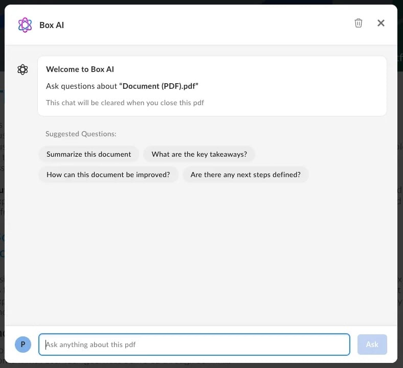
Box AI for UI Elementsは、追加機能によってコンテンツプレビューUI Elementを強化するため、開発者はPlatformアプリにBox Q\&A AI機能を追加できるようになります。Box AIの機能で強化されたプレビューUI Elementでは、以下の機能を提供します。
* Q\&Aとドキュメントの要約。
* Box AIとの会話をリセットする \[**会話をクリア**] ボタン。
* 回答の下に表示される引用情報 (回答に含まれる場合)。
* 箇条書きや表などのマークダウン形式の応答のリクエストを可能にする、書式設定サポート。
* 可能な限り最適な応答を得られるように以前のコンテキストの参照を可能にする、質問履歴。質問履歴は現在のセッションの間のみ保持されます。
* 会話をサポートするために、デフォルトでチャットの先頭に表示される質問の候補。
 ### Box AI for UI Elementsの有効化
コンテンツプレビューのヘッダーでBox AIウィンドウを有効にするには、以下の手順に従います。
1. NodeおよびReactのバージョンが`18.x`以上であることを確認します。
2. [Box AI for UI Elementsを含むnpmパッケージ][aipackage]をダウンロードするか、Box CDNから直接ダウンロードします。
3. 以下のピア依存関係をインストールします。
* [`box-ai-content-answers`][box-ai-content-answers]
* [`blueprint-web`][blueprint-web]
* [`blueprint-web-assets`][blueprint-web-assets]
そのためには、次のコマンドを実行します。
```sh theme={null}
npx install-peerdeps box-ui-elements@^22.0.0
```
### JavaScriptの使用
Box AIの機能を有効にするには、以下を渡します。
* `true`に設定した`hasHeader`プロパティ
* `contentAnswersProps`プロパティ。デフォルトで`show`、`isCitationsEnabled`、`isMarkdownEnabled`、`isResetChatEnabled`、`suggestedQuestions`の各フィールドが含まれています。
```js theme={null}
const preview = new Box.Preview();
const suggestedQuestions = [
{
label: 'What are the key takeaways?',
prompt: 'What are the key takeaways?',
id: '1234',
},
{
label: 'Summarize this document',
prompt: 'Summarize this document',
id: '5678',
},
];
preview.show(, , {
container: '.preview-container',
contentAnswersProps={
show: true,
isCitationsEnabled: true,
isMarkdownEnabled: true,
isResetChatEnabled: true,
suggestedQuestions
}
hasHeader: true,
});
```
### Reactコンポーネントの使用
ReactコンポーネントのヘッダーにBox AI要素を追加することもできます。そのためには、以下を追加します。
* `true`に設定した`hasHeader`プロパティ
* `contentAnswersProps`プロパティ。デフォルトで`show`、`isCitationsEnabled`、`isMarkdownEnabled`、`isResetChatEnabled`、`suggestedQuestions`の各フィールドが含まれています。
`suggestedQuestions`を適切にローカライズするには、プロンプトが翻訳されていることを確認してください。省略可能な`label`プロパティはスクリーンリーダー用であるのに対し、`prompt`プロパティはAIウィンドウでユーザーに表示されるテキストです。
```js theme={null}
import ContentPreview from 'box-ui-elements/es/elements/content-preview';
import { IntlProvider } from "react-intl";
const suggestedQuestions = [
{
label: 'Key takeaways',
prompt: 'What are the key takeaways from this document?',
id: '1234',
},
{
label: 'Summarize',
prompt: 'Summarize this document',
id: '5678',
},
];
export default () => {
// Storing variables in the front end is not secure.
// You will want to grab this value from a database for production
const TOKEN = process.env.REACT_APP_BOX_DEVELOPER_TOKEN
const FILE_ID = process.env.REACT_APP_BOX_PREVIEW_FILE_ID
return (
);
};
```
今回のリリースで提供されるコンテンツプレビュー用のイベントリスナー (`onAsk`、`onClearConversations`、`onRequestClose`) を使用して、さらにアプリをカスタマイズできます。
## スコープ
アプリケーションで、エンドユーザーがコンテンツプレビュー機能のサブセットのみにアクセスできるようにする必要がある場合は、ダウンスコープを使用して、アクセストークンを適切にダウンスコープして必要な権限のセットを含むトークンを生成し、コンテンツプレビューを初期化するエンドユーザークライアントに安全に渡すことができます。
以下は、ダウンスコープと一緒に使用する、UI Element固有の新しいスコープのセットです。こうしたスコープにより、開発者は、ダウンスコープされたトークンに適切なスコープを構成して、コンテンツプレビューのUIコントロールを有効/無効にすることができます。詳細については、Box UI Elementsの専用スコープを参照してください。
### 基本スコープ
| スコープ名 | 付与される権限 |
| -------------- | ------------------------ |
| `base_preview` | ファイルのプレビューのみをユーザーに許可します。 |
### 機能のスコープ
| スコープ名 | 付与される権限 |
| ---------------------- | --------------------------------------------------------------------------------------------------------------------------------------------------------------------------------------------- |
| `item_download` | 生成されたプレビューからのコンテンツのダウンロード/印刷を許可します。 |
| `annotation_edit` | ユーザーに注釈の編集 (削除) を許可します。注: ハイライトによる注釈を使用できるようにするには、ユーザーに対して、ドキュメントのテキストレイヤーを有効にする必要があります。テキストレイヤーは、ファイルのダウンロード権限を持たないすべてのユーザーで無効になっています。ユーザーのハイライト注釈を有効にするには、ユーザーにファイルのダウンロード権限があることを確認してください。 |
| `annotation_view_all` | ユーザーに全ユーザーの注釈の表示を許可します。 |
| `annotation_view_self` | ユーザーに自分の注釈のみの表示を許可します。 |
**スコープを使用してハイライトによる注釈を有効にする** ハイライト注釈は`annotation_edit`および`annotation_view_all`スコープに含まれていません。ハイライトを有効にするには、ダウンスコープされたアクセストークンに`item_download`スコープを含める必要があります。
### サンプルのシナリオ
| シナリオ | スコープ |
| ----------------------------------------------------------------------------------------------- | ----------------------------------------------------------- |
| ユーザーがプレビューのみできるようにする (ダウンロード/印刷、注釈は不可) | `base_preview` |
| ユーザーがプレビュー、ダウンロード、印刷を実行できるようにする | `base_preview` + `item_download` |
| ユーザーがプレビュー、すべての注釈の表示を実行できるようにする (注釈のダウンロード、印刷、作成は不可) | `base_preview` + `annotation_view_all` |
| ユーザーがプレビュー、注釈の作成 (表示できるのは自分の注釈のみ) を実行できるようにする | `base_preview` + `annotation_view_self` + `annotation_edit` |
| ユーザーがプレビュー、注釈の編集、すべての注釈の表示を実行できるようにする | `base_preview` + `annotation_view_all` + `annotation_edit` |
| ユーザーがプレビュー、自分の注釈の表示のみ (追加/削除は不可) を実行できるようにする (例: レビュー期間が終了したら、すべてのドキュメントを読み取り専用モードで保存する必要がある場合) | `base_preview` + `annotation_view_self` |
[filetypes]: https://support.box.com/hc/ja/articles/360043695794-Box-Content-Previewでサポートされるファイル
[annotations]: https://github.com/box/box-annotations
[buie]: https://github.com/box/box-ui-elements/releases/tag/v16.0.0
[previewlib]: https://github.com/box/box-content-preview
[aipackage]: https://www.npmjs.com/package/box-ui-elements/v/22.0.0
[blueprint-web]: https://www.npmjs.com/package/@box/blueprint-web
[box-ai-content-answers]: https://www.npmjs.com/package/@box/box-ai-content-answers
[blueprint-web-assets]: https://www.npmjs.com/package/@box/blueprint-web-assets
### Box AI for UI Elementsの有効化
コンテンツプレビューのヘッダーでBox AIウィンドウを有効にするには、以下の手順に従います。
1. NodeおよびReactのバージョンが`18.x`以上であることを確認します。
2. [Box AI for UI Elementsを含むnpmパッケージ][aipackage]をダウンロードするか、Box CDNから直接ダウンロードします。
3. 以下のピア依存関係をインストールします。
* [`box-ai-content-answers`][box-ai-content-answers]
* [`blueprint-web`][blueprint-web]
* [`blueprint-web-assets`][blueprint-web-assets]
そのためには、次のコマンドを実行します。
```sh theme={null}
npx install-peerdeps box-ui-elements@^22.0.0
```
### JavaScriptの使用
Box AIの機能を有効にするには、以下を渡します。
* `true`に設定した`hasHeader`プロパティ
* `contentAnswersProps`プロパティ。デフォルトで`show`、`isCitationsEnabled`、`isMarkdownEnabled`、`isResetChatEnabled`、`suggestedQuestions`の各フィールドが含まれています。
```js theme={null}
const preview = new Box.Preview();
const suggestedQuestions = [
{
label: 'What are the key takeaways?',
prompt: 'What are the key takeaways?',
id: '1234',
},
{
label: 'Summarize this document',
prompt: 'Summarize this document',
id: '5678',
},
];
preview.show(, , {
container: '.preview-container',
contentAnswersProps={
show: true,
isCitationsEnabled: true,
isMarkdownEnabled: true,
isResetChatEnabled: true,
suggestedQuestions
}
hasHeader: true,
});
```
### Reactコンポーネントの使用
ReactコンポーネントのヘッダーにBox AI要素を追加することもできます。そのためには、以下を追加します。
* `true`に設定した`hasHeader`プロパティ
* `contentAnswersProps`プロパティ。デフォルトで`show`、`isCitationsEnabled`、`isMarkdownEnabled`、`isResetChatEnabled`、`suggestedQuestions`の各フィールドが含まれています。
`suggestedQuestions`を適切にローカライズするには、プロンプトが翻訳されていることを確認してください。省略可能な`label`プロパティはスクリーンリーダー用であるのに対し、`prompt`プロパティはAIウィンドウでユーザーに表示されるテキストです。
```js theme={null}
import ContentPreview from 'box-ui-elements/es/elements/content-preview';
import { IntlProvider } from "react-intl";
const suggestedQuestions = [
{
label: 'Key takeaways',
prompt: 'What are the key takeaways from this document?',
id: '1234',
},
{
label: 'Summarize',
prompt: 'Summarize this document',
id: '5678',
},
];
export default () => {
// Storing variables in the front end is not secure.
// You will want to grab this value from a database for production
const TOKEN = process.env.REACT_APP_BOX_DEVELOPER_TOKEN
const FILE_ID = process.env.REACT_APP_BOX_PREVIEW_FILE_ID
return (
);
};
```
今回のリリースで提供されるコンテンツプレビュー用のイベントリスナー (`onAsk`、`onClearConversations`、`onRequestClose`) を使用して、さらにアプリをカスタマイズできます。
## スコープ
アプリケーションで、エンドユーザーがコンテンツプレビュー機能のサブセットのみにアクセスできるようにする必要がある場合は、ダウンスコープを使用して、アクセストークンを適切にダウンスコープして必要な権限のセットを含むトークンを生成し、コンテンツプレビューを初期化するエンドユーザークライアントに安全に渡すことができます。
以下は、ダウンスコープと一緒に使用する、UI Element固有の新しいスコープのセットです。こうしたスコープにより、開発者は、ダウンスコープされたトークンに適切なスコープを構成して、コンテンツプレビューのUIコントロールを有効/無効にすることができます。詳細については、Box UI Elementsの専用スコープを参照してください。
### 基本スコープ
| スコープ名 | 付与される権限 |
| -------------- | ------------------------ |
| `base_preview` | ファイルのプレビューのみをユーザーに許可します。 |
### 機能のスコープ
| スコープ名 | 付与される権限 |
| ---------------------- | --------------------------------------------------------------------------------------------------------------------------------------------------------------------------------------------- |
| `item_download` | 生成されたプレビューからのコンテンツのダウンロード/印刷を許可します。 |
| `annotation_edit` | ユーザーに注釈の編集 (削除) を許可します。注: ハイライトによる注釈を使用できるようにするには、ユーザーに対して、ドキュメントのテキストレイヤーを有効にする必要があります。テキストレイヤーは、ファイルのダウンロード権限を持たないすべてのユーザーで無効になっています。ユーザーのハイライト注釈を有効にするには、ユーザーにファイルのダウンロード権限があることを確認してください。 |
| `annotation_view_all` | ユーザーに全ユーザーの注釈の表示を許可します。 |
| `annotation_view_self` | ユーザーに自分の注釈のみの表示を許可します。 |
**スコープを使用してハイライトによる注釈を有効にする** ハイライト注釈は`annotation_edit`および`annotation_view_all`スコープに含まれていません。ハイライトを有効にするには、ダウンスコープされたアクセストークンに`item_download`スコープを含める必要があります。
### サンプルのシナリオ
| シナリオ | スコープ |
| ----------------------------------------------------------------------------------------------- | ----------------------------------------------------------- |
| ユーザーがプレビューのみできるようにする (ダウンロード/印刷、注釈は不可) | `base_preview` |
| ユーザーがプレビュー、ダウンロード、印刷を実行できるようにする | `base_preview` + `item_download` |
| ユーザーがプレビュー、すべての注釈の表示を実行できるようにする (注釈のダウンロード、印刷、作成は不可) | `base_preview` + `annotation_view_all` |
| ユーザーがプレビュー、注釈の作成 (表示できるのは自分の注釈のみ) を実行できるようにする | `base_preview` + `annotation_view_self` + `annotation_edit` |
| ユーザーがプレビュー、注釈の編集、すべての注釈の表示を実行できるようにする | `base_preview` + `annotation_view_all` + `annotation_edit` |
| ユーザーがプレビュー、自分の注釈の表示のみ (追加/削除は不可) を実行できるようにする (例: レビュー期間が終了したら、すべてのドキュメントを読み取り専用モードで保存する必要がある場合) | `base_preview` + `annotation_view_self` |
[filetypes]: https://support.box.com/hc/ja/articles/360043695794-Box-Content-Previewでサポートされるファイル
[annotations]: https://github.com/box/box-annotations
[buie]: https://github.com/box/box-ui-elements/releases/tag/v16.0.0
[previewlib]: https://github.com/box/box-content-preview
[aipackage]: https://www.npmjs.com/package/box-ui-elements/v/22.0.0
[blueprint-web]: https://www.npmjs.com/package/@box/blueprint-web
[box-ai-content-answers]: https://www.npmjs.com/package/@box/box-ai-content-answers
[blueprint-web-assets]: https://www.npmjs.com/package/@box/blueprint-web-assets